Judging Your Book Cover
by Elizabeth Solar
Warning: Real estate is my porn, and will often arise metaphorically in this piece, as well as the merits of drinking wine. Be advised: Viewing Zillow.com while imbibing may be hazardous to your relationship.
I’m no wine aficionado, but I know what I like. When I don’t find it at the local wine and spirits shop, I gravitate toward the bottle with an appealing label. A simple, elegant logo makes spending seven dollars feel more aspirational. Witty names and audacious logs beckon, so I throw caution to the wind, and select a sassy, little vintage. What can I say? Deep down, I’m all about the surface.
We humans are kind of shallow when you come down to it. We go for looks. That’s why as we craft our novels, and thoughtfully revise, edit and format, let’s consider how to dress up our stories so we can close the literary deal.
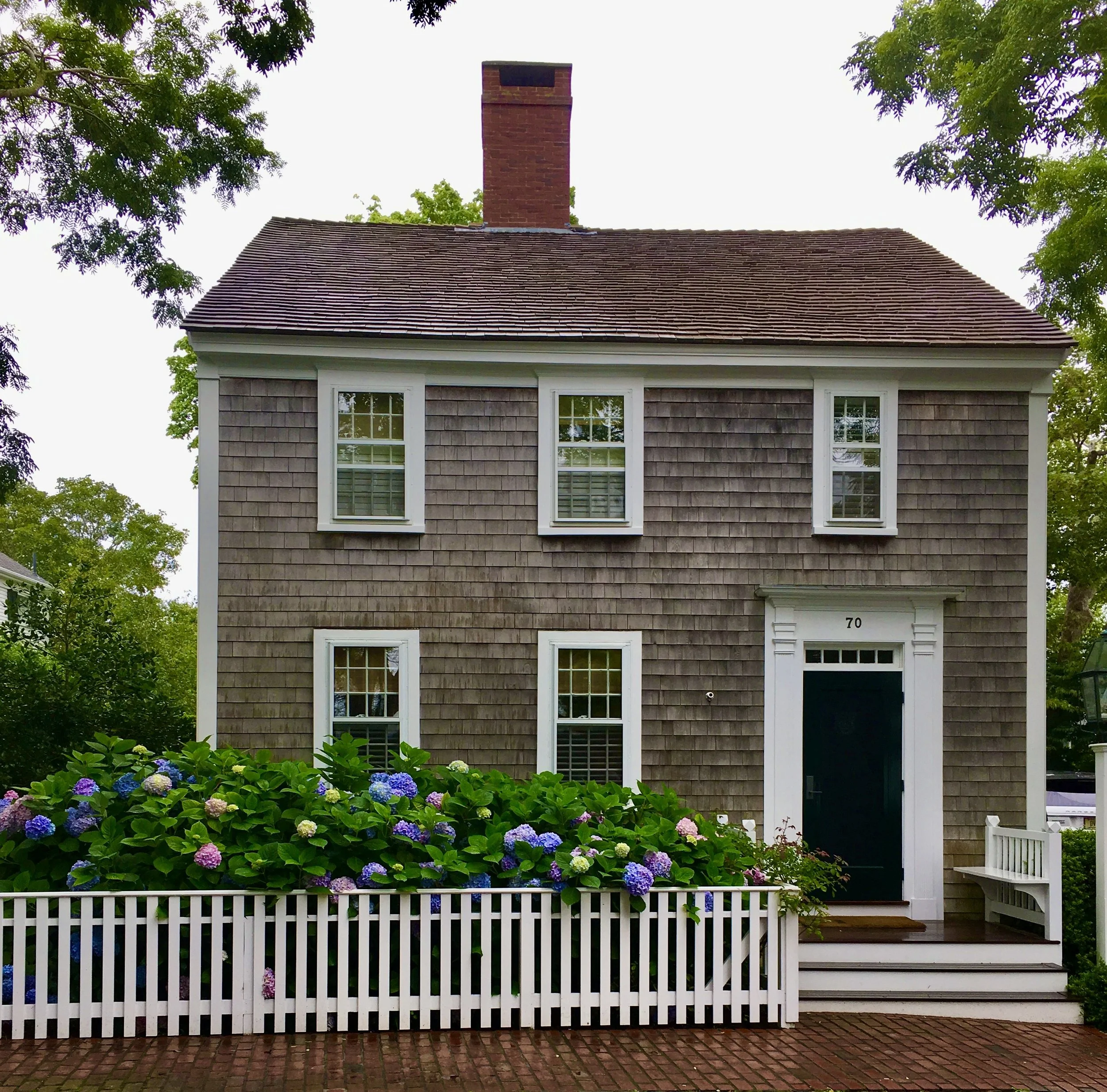
Like any retail space, bookstores provide a limited real estate, so it’s not always a seller’s market. Just like in selling a home, it’s important your cover conveys a certain ‘curb appeal’ to your potential reader, so they don’t walk by your book, but instead stop by, drop in and maybe explore inside for a while. Some book covers are so intriguing, the content itself may be secondary. Ideally what’s inside should fulfill the promise of the fabulous exterior, whether it's dark and dramatic, warm and cozy, sometimes a little haunted.
The following titles deliver on the promise of their iconic graphics: Artist and jazz musician Paul Bacon’s stunning red, white and blue take on the cover of Catch-22. The color blue is featured prominently in Francis Cugat’s rendering of ‘celestial eyes’ that graces the cover of The Great Gatsby, as well as Dr. Seuss’ The Cat in the Hat, designed by the author himself.
While looks may not be everything, consider that we are visual creature who first perceive, then experience our world as images. Hence the adage about a picture being worth a thousand – or in the case of most novels, 85 thousand – words. So, how do you capture that? Go for impact. Go for emotion. Bright colors (That blue, red, white and black of The Cat in the Hat) grab attention. The red and yellow used to disturbing effect in the Catcher in the Rye. The wood cut black and white hills and sky against a verdant background of grass and trees offer an invitation to J.RR. Tolkien’s time 'between the Dawn of the Faerie and the Dominion of Man' in The Hobbit.
Like is drawn to like, so use human figures to catch a reader’s eye. Witness the The Grapes of Wrath’s muted rural watercolor, featuring a lone, melancholy figure, or Joseph Hirsch’s rendering of Death of a Salesman’s defeated and hunched Willy Loman. Marshall Arisman’s creepy portrayal of an American Psycho performs double duty: Providing a face of human evil, along with a graphic style that reflects the darkness within.
Impactful cover art complements your genre. No hearts and flowers for mystery or suspense books. No garish neon colors for a romance.
Just as what you say inside the cover of your book creates a feeling, so do your graphics, and font. The slash through the vertical lettering of Robert Bloch’s Psycho portends gore and uneasy mother-son relationship. Mario Puzo’s The Godfather telegraphs the violence that comes with power, passion, and taking offers you can refuse through the title’s red font, manipulated by an unseen puppeteer. Don't even get me started talking about Room, its uppercase font a child's scrawl of primary colors against a stark white background.
So, where do you start with your cover design? Find a graphic artist with not only an understanding of publishing, but also gets your book. If you don’t know one, or don’t know where to look, sites like 99designs.com, freelancer.com or design crowd provide options. If you’re budget is limited, try BookCover Machine, SelfPub Book Covers, or Creative Paramita sites that offer design services for 100 dollars and under. Find even thriftier options for photos and images from Pexel, Pixabay, Getty Images or Shutter stock. Many creatives barter, exchanging their writing services for graphic design.
Have doubts about your cover, or undecided about options? Crowdsource. Poll your beta readers on potential designs. Post multiple options, or split test potential covers on Amazon, Goodreads or Manybooks. They’ll tell you whether the cover needs a little cosmetic TLC, is a total fixer upper, or is a one-of-a-kind classic, or dramatic showplace. If your cover is in the latter category, and you've enticed readers to take a closer look, it's time to bring them inside. Here's to a full house.
Read more about the power of book covers, and see examples of great ones here.
https://www.shortlist.com/entertainment/the-50-coolest-book-covers/99150
https://www.americaninno.com/boston/the-power-of-a-cover/


